Data Visualisation and Beautiful Report Design
Communication is the last and most delicate step following the analysis. It communicates sophisticated results to people unrelated to technology and without profound statistical skills, making your work usable and sellable to business. Therefore it is important to know how to convey the message in a simple way with the help of expressive and well thought-out graphics. Finally, we will look at the R technologies to make the reports reproducible on updated data at the cost of a click. You will learn how to use ggplot2 as well as other interactive JS visualization tools. You will also learn how to build a customized and automated PDF or HTML reports, or even slides, with R Markdown.
Topics include
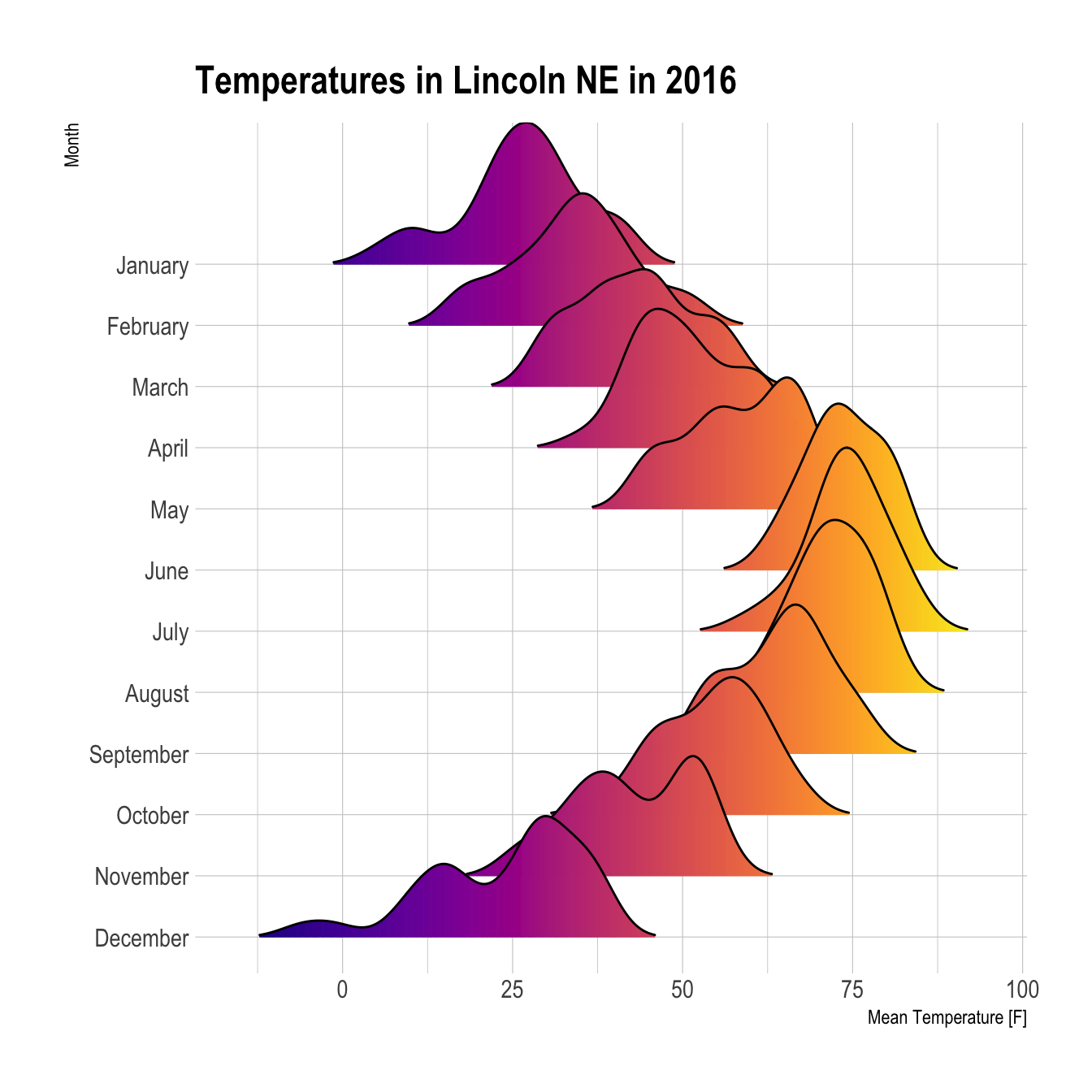
- General Grammar of Graphics with Ggplot2
- How to explore data with Visualizations
- Univariate analysis plots
- Multivariate analysis plots
- Matrix and Grid plots
- Graphics with multiple layers
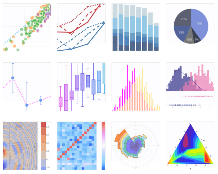
- Specific plots and graphs with HTMLWidgets
- Bar charts
- Area plots
- Dots and Bubble charts
- Time series plots
- Carpet plots
- Graph and Sankey plots
- Plots from models
- Interactive plots
- 3D plots
- Hexbin plots
- Sunburst plots
- Heatmaps
- Pivot
- Contour plots
- RMarkdown reproducible and instantaneous reports
- Static Printable PDF reports
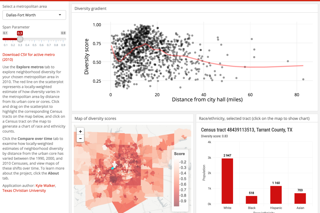
- Interactive Reports
- Interactive Dashboards
- Presentations with Data
What you will be able to do
- Quickly create visualization to understand the data set
- Graphically highlight relationships in data
- Choose the best representation for the data types you have
- Use specific plot for Graphs or other visualizations
- Present results either as PDF, verbose reports, Dashboards or Slides
Duration
1 or 2 days.
Pre requisites
None.
Audience
This course is a fundamental for every business area. It is especially useful for professionals that need to express insights with professional graphics and to create understandable Graphics and presentations.


